Radical redesigned of navigation & homepage coming to Xero users

Xero has unveiled a prototype of its redesigned navigation and homepage, aimed at providing a more intuitive, insight-rich experience. The company says the refresh has been "built for you, with you," reflecting feedback from thousands of its customers.
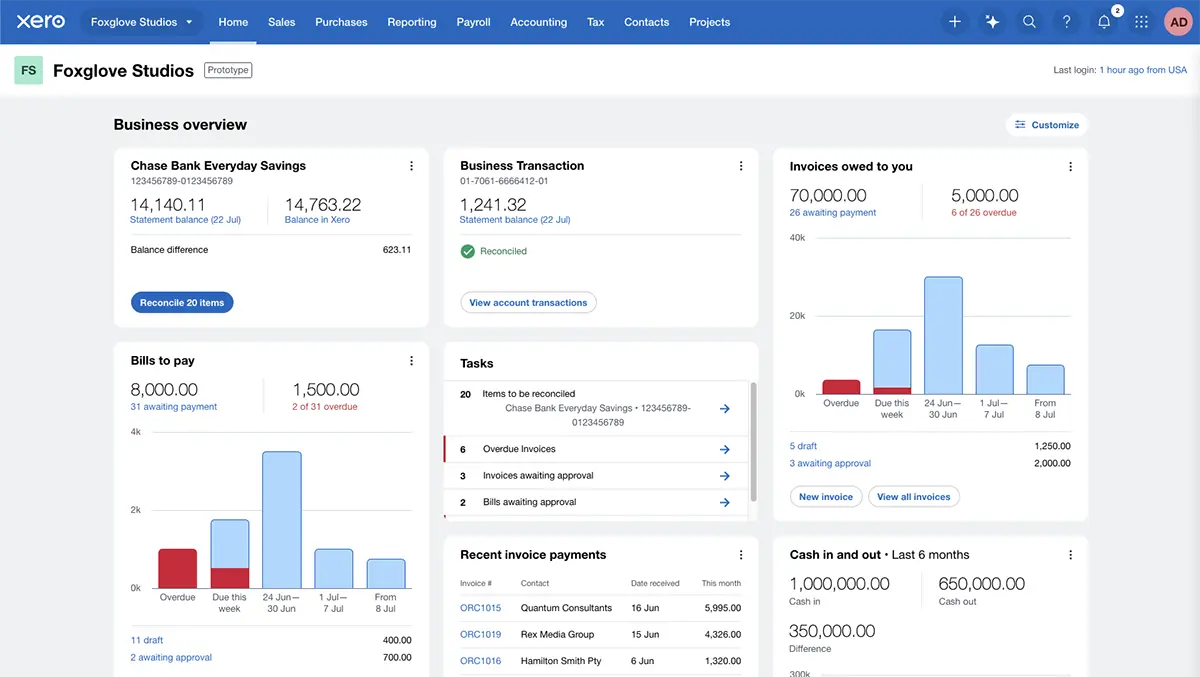
The new navigation is designed to help users "find what you need faster, and move more easily from one task to the next, with simpler labels and logical groupings." The updated homepage introduces new and improved widgets, including tools for daily tasks, recently paid invoices, and profit-and-loss summaries. Users will also be able to customise the layout by showing, hiding, and moving elements to suit their priorities. As Xero describes it, this allows customers to "see what matters most to you."
The redesign is the result of extensive collaboration with the company's user base. According to Xero, 3,000 customers helped shape the new experience from the outset, and 30,000 beta testers are currently involved in fine-tuning it. Their feedback ranges from praise for the look and feel to suggestions on where improvements can be made. One tester summed up their first impression with the comment: "Simple, clean and beautiful."
Customers are being invited to explore the new navigation and homepage through a beta programme before the official launch. The navigation update is scheduled to go live in September, while the redesigned homepage will be rolled out later this year. During the beta period, Xero is gathering feedback and insights to ensure the updates are ready for broader release.
In its frequently asked questions section, the company explains that the changes are intended "to deliver a more valuable experience to our customers, based on the feedback and needs you've communicated." The aim is to help users take action on important tasks quickly, with key business performance metrics and jobs-to-be-done visible at a glance. Customisable widgets allow individuals to focus on the elements most relevant to them.
The prototype is described as "a working, interactive model of these upcoming features," offering a hands-on preview of the look and feel before launch. The beta is "a continuation of our collaboration with customers, to test the experience and keep refining it before it is made available to everyone."
Xero also notes that the redesign is part of an ongoing effort to improve its platform, with the goal of giving customers time back to focus on what matters most to them. The approach, the company says, is not just about introducing new features but ensuring they are built in a way that aligns with how users work.
For now, customers in the beta can explore the navigation changes, test the new homepage widgets, and customise their layouts. The feedback gathered during this period will inform final adjustments before the updates are deployed to all users later in the year.

